
Celebrating Indigenous placekeeping at Rouge National Urban Park

From 2019 through 2020, a custom design catalogue was developed by the Indigenous Design Studio of Brook McIlroy in collaboration with Rouge National Urban Park and representatives of the First Nations Advisory Circle. This initiative, known as “Common Look and Feel”, aims to holistically incorporate custom and contemporary Indigenous place-keeping designs throughout the park.
Discover the unique and reflective design elements that highlight Rouge National Urban Park as a truly special place.
 About the Indigenous Design Studio of Brook McIlroy
The Indigenous Design Studio of Brook McIlroy is a critical practice that brings together teams of Indigenous architects, designers and student interns from diverse backgrounds and traditions. The studio is dedicated to creating designs that reflect Indigenous cultures and histories, fostering a deeper connection to the land, as well as exploring sustainable design practices in contemporary place-making.
 Common Look and Feel inspiration
The design concept for Common Look and Feel was developed through interpretive research, reference to the archaeological record connected to the landscape of the park, and iterative engagement with 10 First Nation partners from the Mississaugas, Chippewas, Haudenosaunee and Wendat communities. The aim of the Common Look and Feel project is to visually reinforce Indigenous presence on the landscape through signage, built infrastructure and exhibition. By integrating these designs throughout the Rouge, these elements will help to educate visitors about Indigenous histories, culture and relationships with the land.
“The rivers were our roads, a way to connect people and the land.”
– Louis Lesage, Representative from Huron-Wendat Nation
The Rouge River and its tributaries — which flow through the park and have significant impacts on its diverse natural, cultural and agricultural landscapes — have always been crucial to the land. Common Look and Feel designers wanted to incorporate the twists, turns and convergence of the Rouge River and Little Rouge River into a motif using seed beads, to reflect the importance of the river network to the people and wildlife of the Rouge. The traditional use of beads in trade, diplomacy, ornament and storytelling among both Indigenous and non-Indigenous communities is strongly represented in the archaeological record of the Rouge. For this reason, beading imagery was chosen as a main motif to represent and reflect Indigenous art, storytelling and cross-cultural exchange. In Common Look and Feel, the river brings the beads together, telling a unified story of the park and its significance to Indigenous Peoples.
.png)
 Design Element Highlights
Indigenous motifs
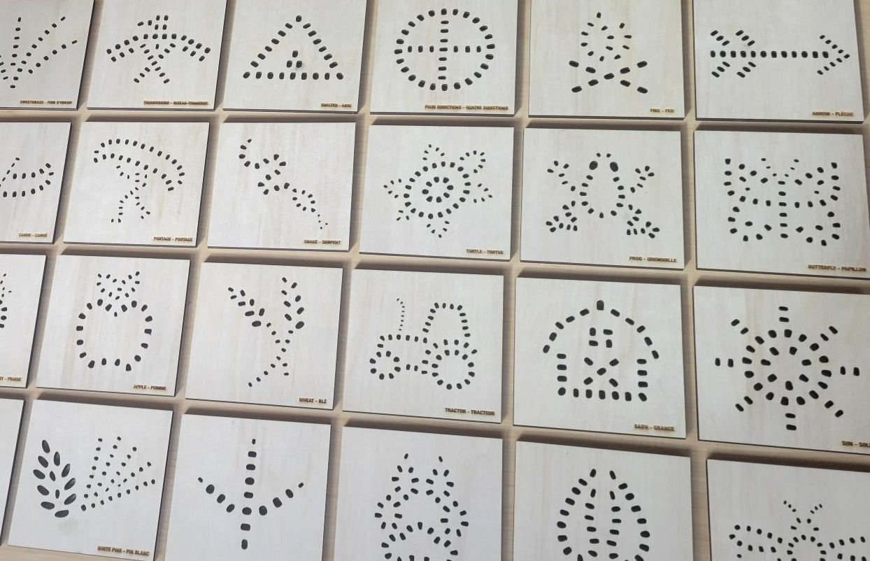
Indigenous motifs are woven throughout the Common Look and Feel design elements to visually highlight interpretive themes significant to different areas of the park. The goal of these elements is to be playful and engaging and to encourage visitors of all ages to engage with the natural and cultural heritage unique to each landscape.
The design elements at the Rouge feature Indigenous motifs inspired by the tradition of beading and its use to record stories of the land, animals and water, among other uses. These seed bead motifs celebrate this rich cultural heritage and are being woven into park elements like benches and signs, creating a beautiful blend of art and storytelling that reflects the park’s natural and cultural landscapes. Next time you are in the park, count how many bead motifs you spot!
Natural materials: Corten steel
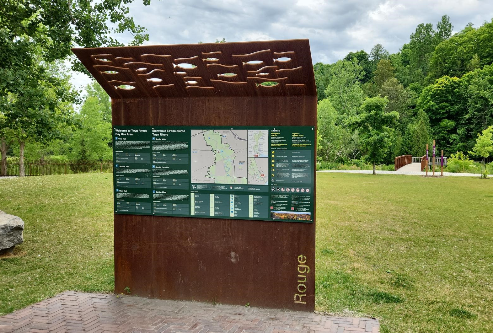
A simple palette of primary materials such as Corten steel and reclaimed wood is used throughout the park’s design elements to ensure consistency and to reflect the park’s raw, natural essence.
Did you know Corten steel, also known as weathering steel, is super strong and resistant to weathering? It forms a protective rust layer that shields it from the elements, making it perfect for outdoor use. Plus, its rustic texture and colour blend beautifully with natural settings like Rouge National Urban Park. Bonus: Corten steel has a lower carbon footprint and requires less maintenance than traditional steel!
Colour patterns
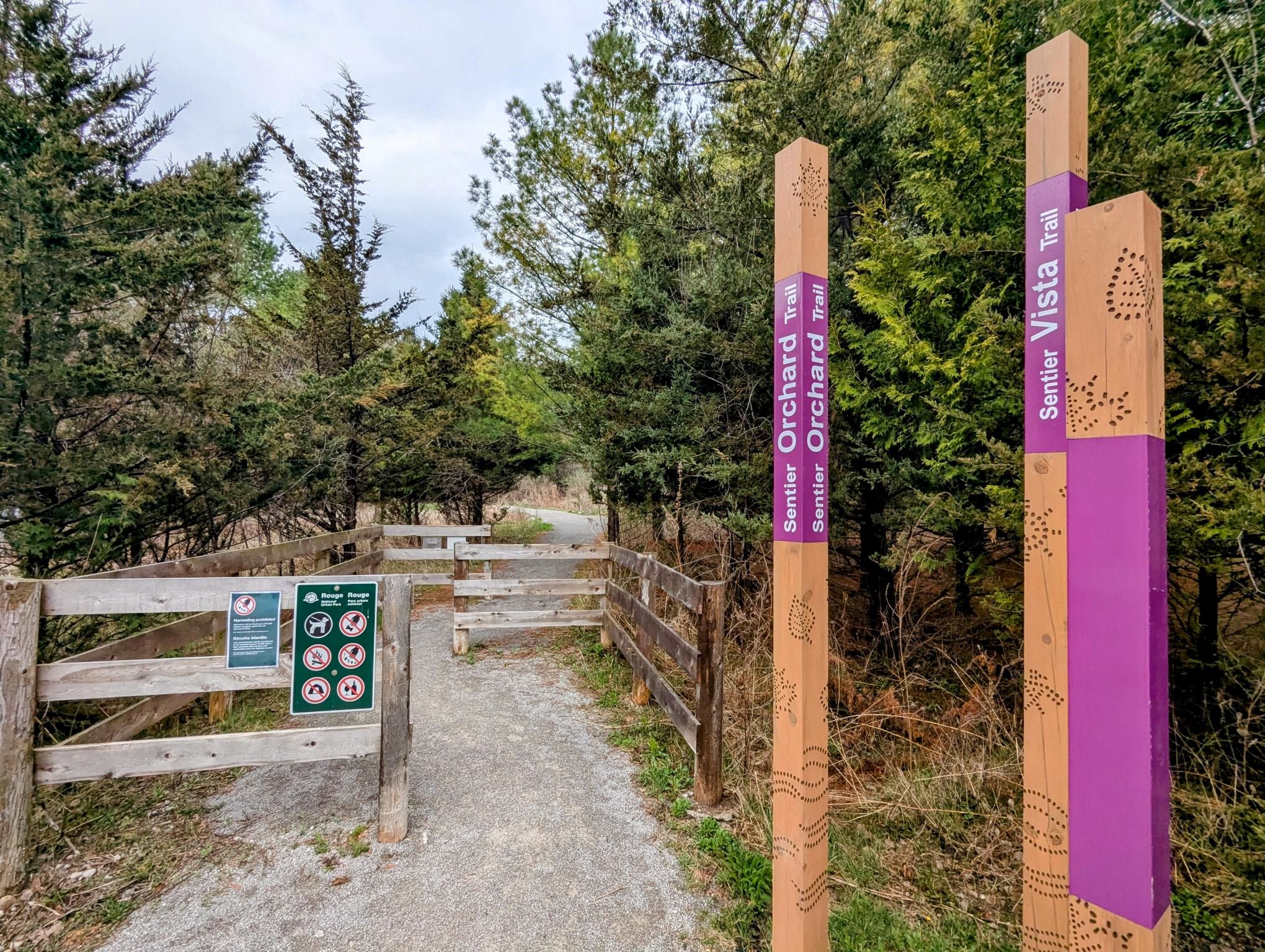
The design elements feature a vibrant color palette inspired by the park’s rich heritage and natural beauty. Warm and light hues, reflecting the tones of the “Three Sisters” crops like corn, and the earthy shades of turtle shells are used throughout the park. These colours enhance exhibits, printed materials and interpretative information, creating a distinct and welcoming look.
Have you spotted a colour pattern on your adventures in the Rouge? Rouge National Urban Park uses two main colours: Parks Canada’s famous Heritage Green (Pantone 553) and Urban Park Plum (Pantone 512) to represent its unique identity within the Parks Canada system. You will find that vehicular and pedestrian signs use Heritage Green to relay their message, while Urban Park Plum can be spotted on interpretive and informational panels throughout the park!
Location identifiers
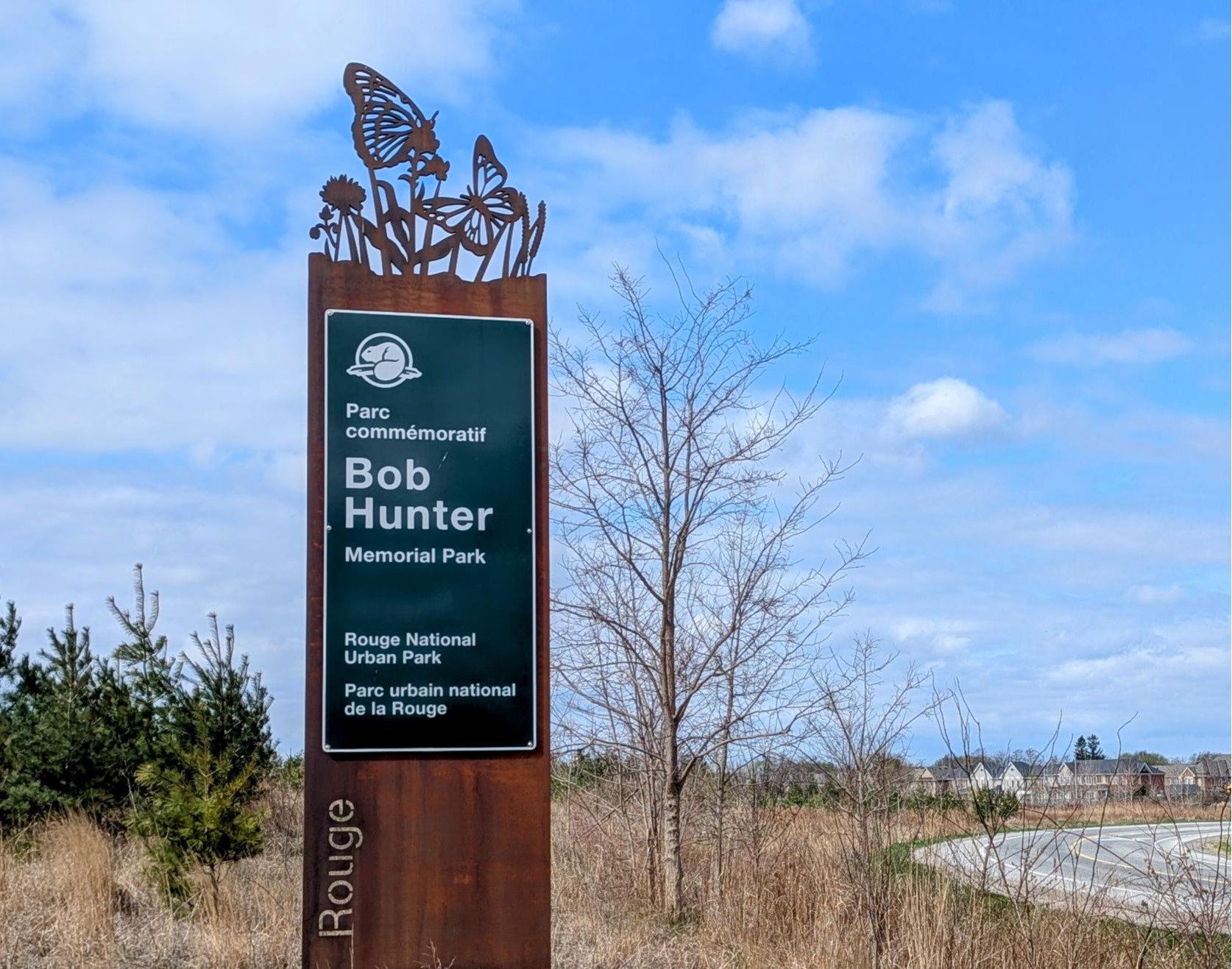
Building and structure design in Rouge National Urban Park has been informed by the diverse historical, natural and cultural landscapes and narratives of the region. These designs are based on historic themes of the Rouge, which are incorporated into Common Look and Feel in contemporary ways. The design creates an immersive experience in nature for visitors, with a strong sense of place in harmony with the natural environment of the park.
Location identifiers such as entrance signs signal to visitors travelling by vehicle that they have reached one of the many destinations in the park. The unique icons carved into the top of each sign have been carefully chosen to highlight a feature of the respective sites.
 Giving thanks to the land

Parks Canada collaborated with the Indigenous graphic design team and Indigenous Language Keepers on the creation of a unique mesh panelling, to be featured along the perimeter of future projects around the park. On your next visit, you may spot this new panelling, which that incorporates the familiar beaded motifs and patterns. These panels reflect the diverse landscapes of the park and were designed to be displayed as a continuous tableau, weaving together the beauty of nature and cultural heritage of the Rouge while Indigenous phrases express deep gratitude for the land.
Here’s a quick guide to the phrases that can be found on the panelling:
| Phrase | Translation | Language |
|---|---|---|
| Dëdwanö:nyo:’ Ha’deyogeo’dza:ge:h | We give thanks to all the grasses | Seneca |
| Tiawenhk inenh yahndawa’ | Thank you to the river | Wendat |
| Nimiigwechiwi’aanaanig niwiijiiwaaganinaanig widosemidiyaang | We give thanks for our friends who have journeyed along life’s path with us | Anishinabemowin |
| Dëyetinönyö:’ jöhehgöh | We give thanks to our life sustainers (Three Sisters) | Seneca |
| Nimiigwechiwendaamin gakina ginaajiwang miziwegamigong | We give thanks for the beauty of our surroundings | Anishinabemowin |
The Common Look and Feel project is a testament to the collaborative efforts between the Indigenous Design Studio of Brook McIlroy, Parks Canada and the Rouge National Urban Park First Nations Advisory Circle. It celebrates Indigenous place-keeping and ensures that the rich histories and cultures of Indigenous peoples are prominently featured throughout the park.
On your next visit to the Rouge, keep your eyes open for the Common Look and Feel around you!
link
")


