Milo: The Process – 8. Cover and elements of book design

This is the eighth post in a making-of series about my upcoming picture book, Milo the Knight, written by Grégoire Laforce. The book has been out since October 15th! Get it from your local indie bookstore, or online retailers (ideally also independent bookstores!!!):
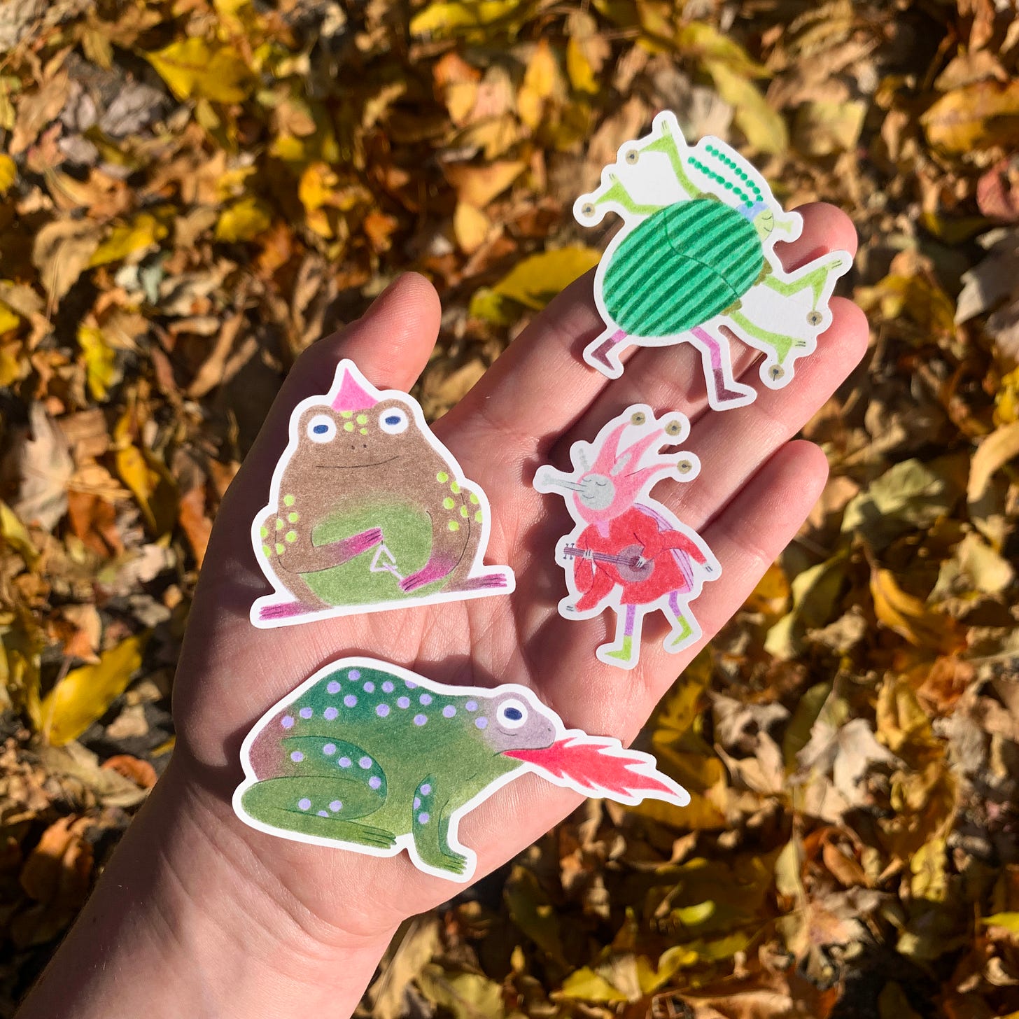
ALSO, I printed a few vinyl stickers! They are available on my Etsy shop if you’d like to buy the set! And while you’re at it, take a look at my 2025 Birds of Quebec Calendar, which I released yesterday.
In the last post, we examined how I drew the final illustrations. In this post, we’ll look at my process for creating the covers and endpapers!
Milo is my first picture book with a dust jacket – which is exciting because it allowed me to create two different covers for the book: one for the jacket, and one for the casewrap underneath!
If you’re not quite clear on what a dust jacket or a casewrap or endpapers are, check out this glossary by Let’s Talk Picture Books.
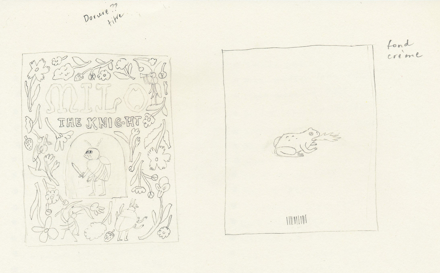
By this point, you won’t be surprised to read that I wanted a cover that was evocative of medieval manuscripts. These are the thumbnail sketches I drew for the front and back covers as I was working on the rest of the storyboard:
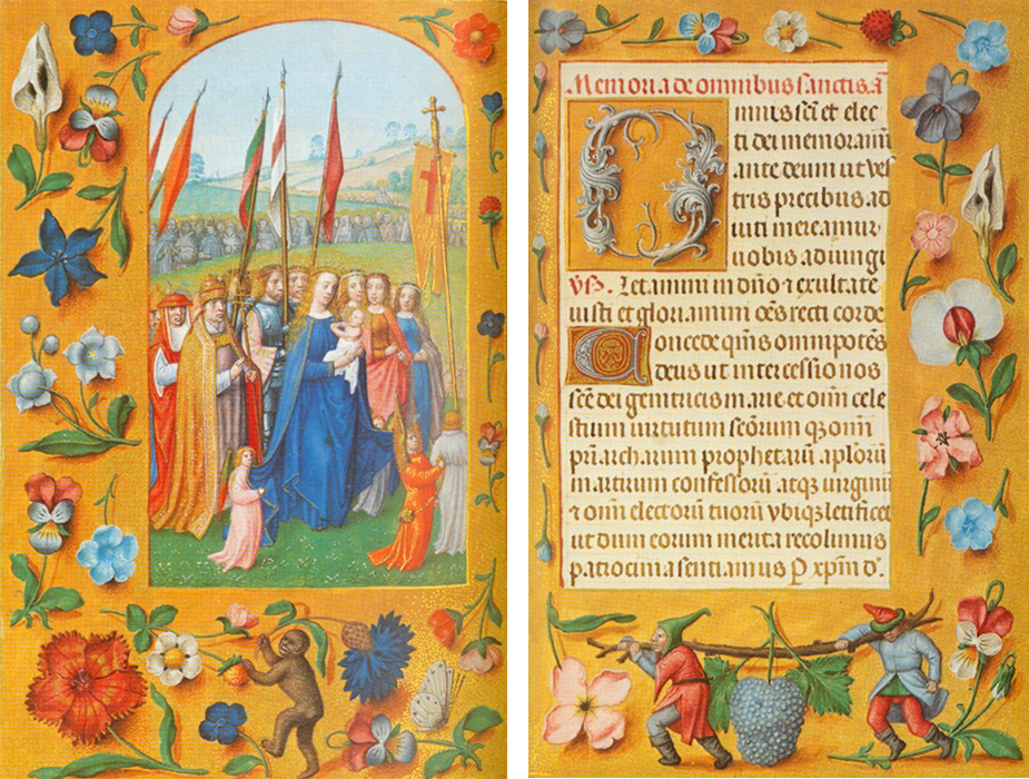
I was inspired by the composition as well as the floating floral elements and characters of two pages from the Rothschild Prayerbook (1500-1520). I loved that it gave me the opportunity to include floral decorative elements remindful of the interior illustrations as well as the narrator and three other court jesters in the margins.
I scanned in my thumbnail and moved the elements around on Procreate to fine-tune the composition (and make room for the names!). Once I liked the composition, I drew a more detailed sketch (also on Procreate). You can see the whole process in this timelapse video:
If you’ve read the previous post about color in this series, you know what came next – a digital color composition! Here it is:
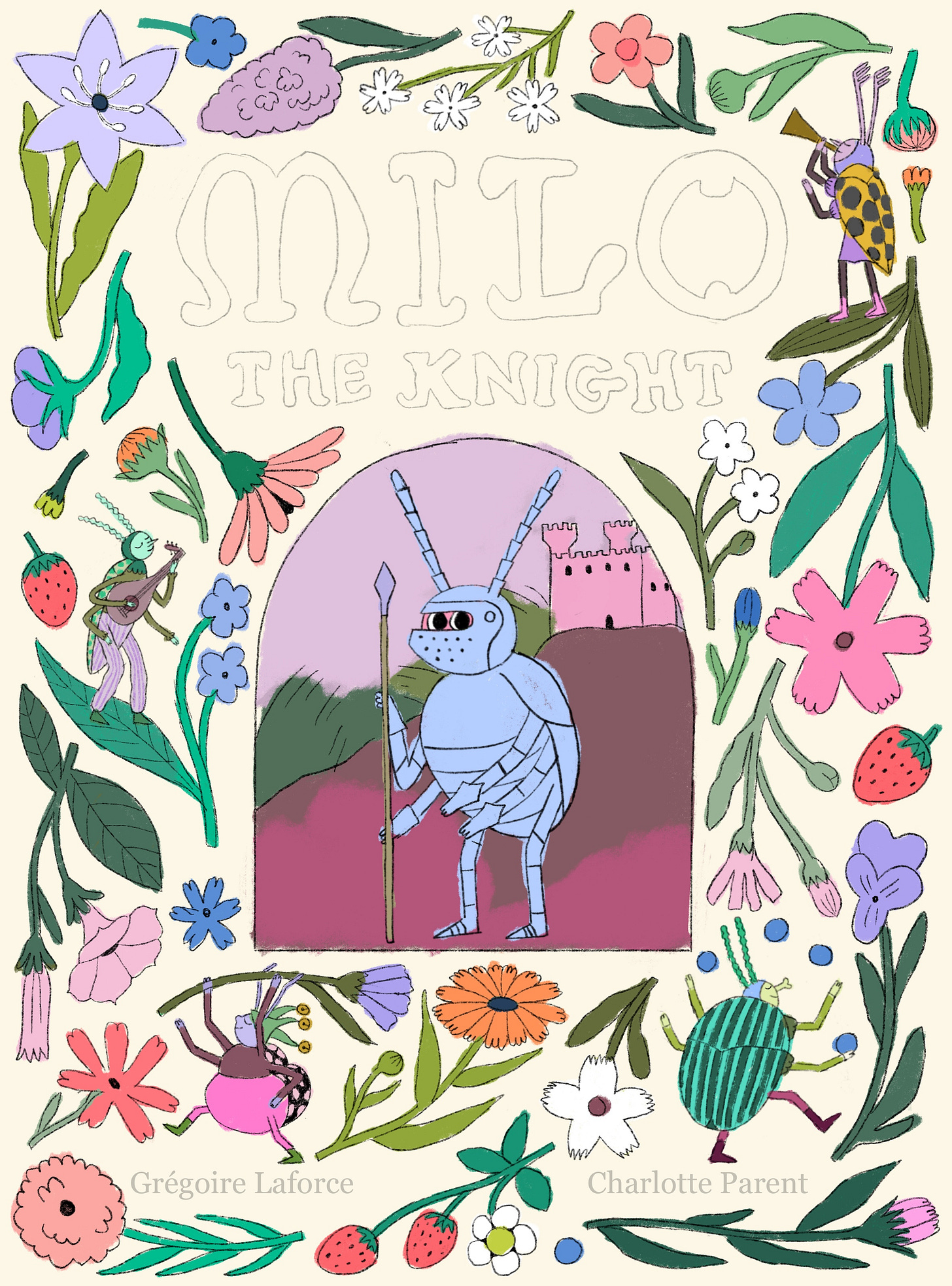
For the cover, however, I didn’t go straight from the digital color comp to the final. I felt like I needed to test my colors on paper first. I printed my sketch at a smaller scale and traced it onto a piece of 9×12 paper (the same as for the finals – Strathmore Smooth Surface Bristol). I used that as an additional color comp – on paper this time. You can see how I recorded which pencils I used on the paper around the image so that I could replicate what was working well on the final. I guess you could say I was a little stressed out about getting this cover right!
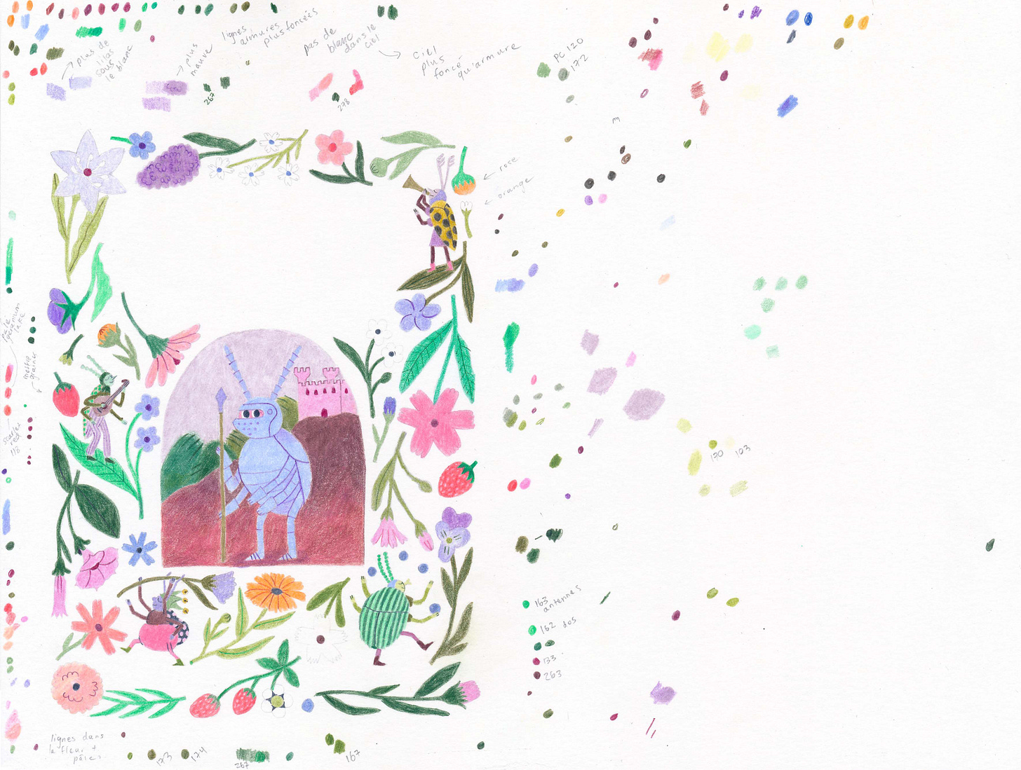
Then, I drew the final illustration at print size.
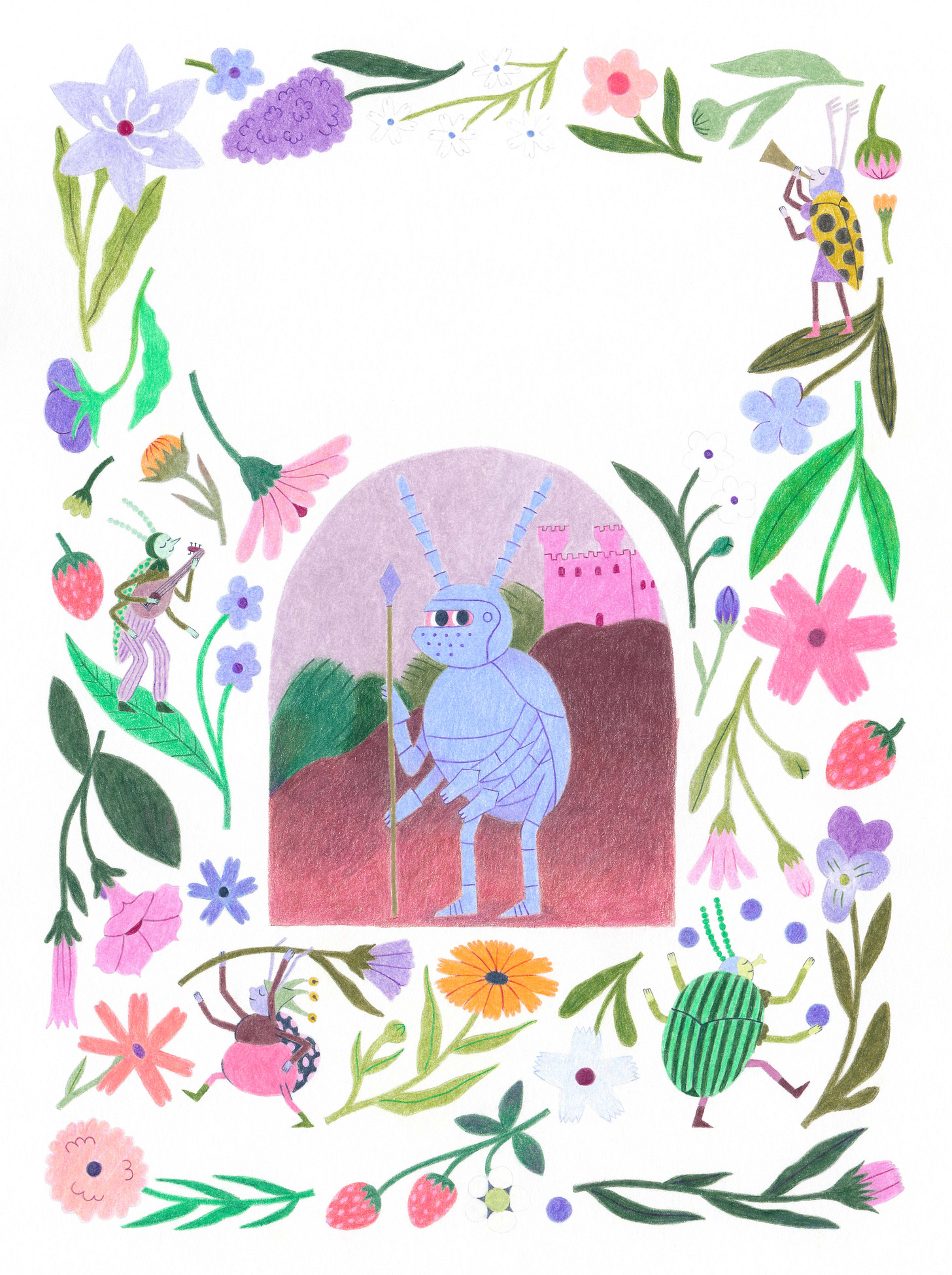
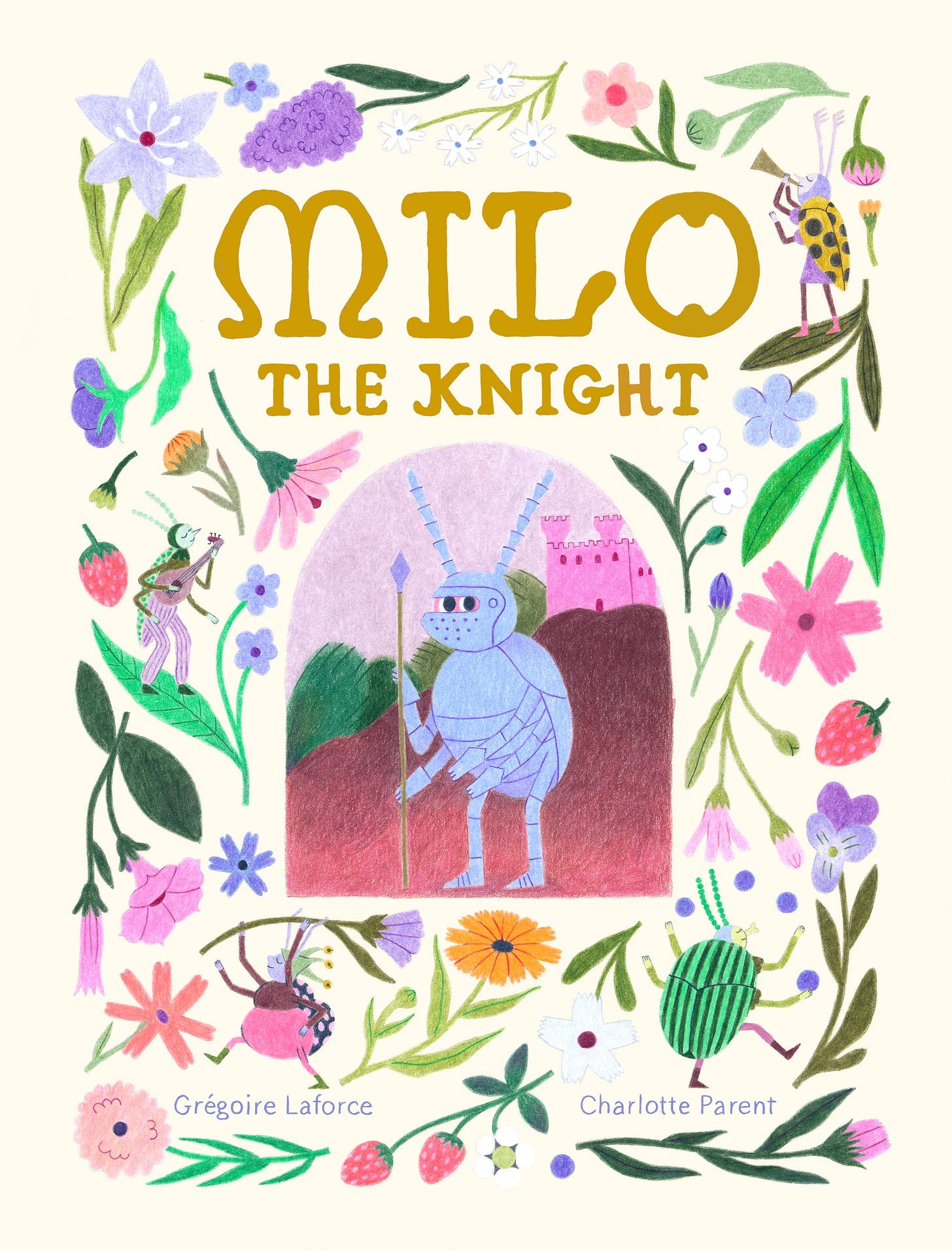
I gave it the cream-colored background I had planned, and I was done! Or so I thought.
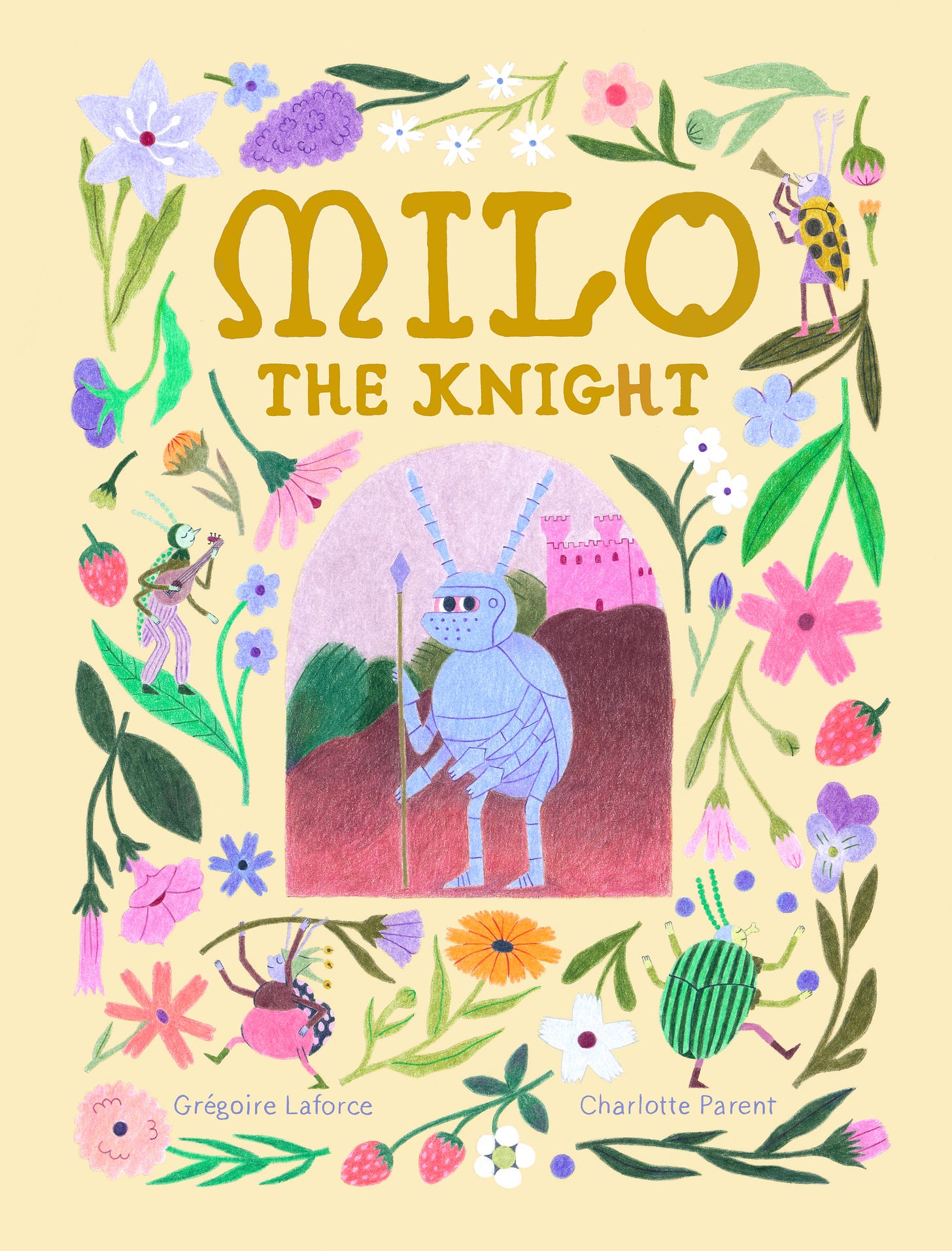
My editor suggested that I try different colors as backgrounds, including darker backgrounds. I tried burgundies and purples, but nothing worked. When I used a dark background, the white paper showing through the elements made the whole thing look really weird. In the end, my editor suggested that I simply try a darker cream color, and that turned out to be the right decision!
Next, she suggested making the central image of Milo a little bigger and adding gold lines around that central part and as a frame around the whole composition. That sounds simple enough, but it required resizing and repositioning all of the decorative elements and the jesters to make some room. The changes are subtle, but they took a long time!
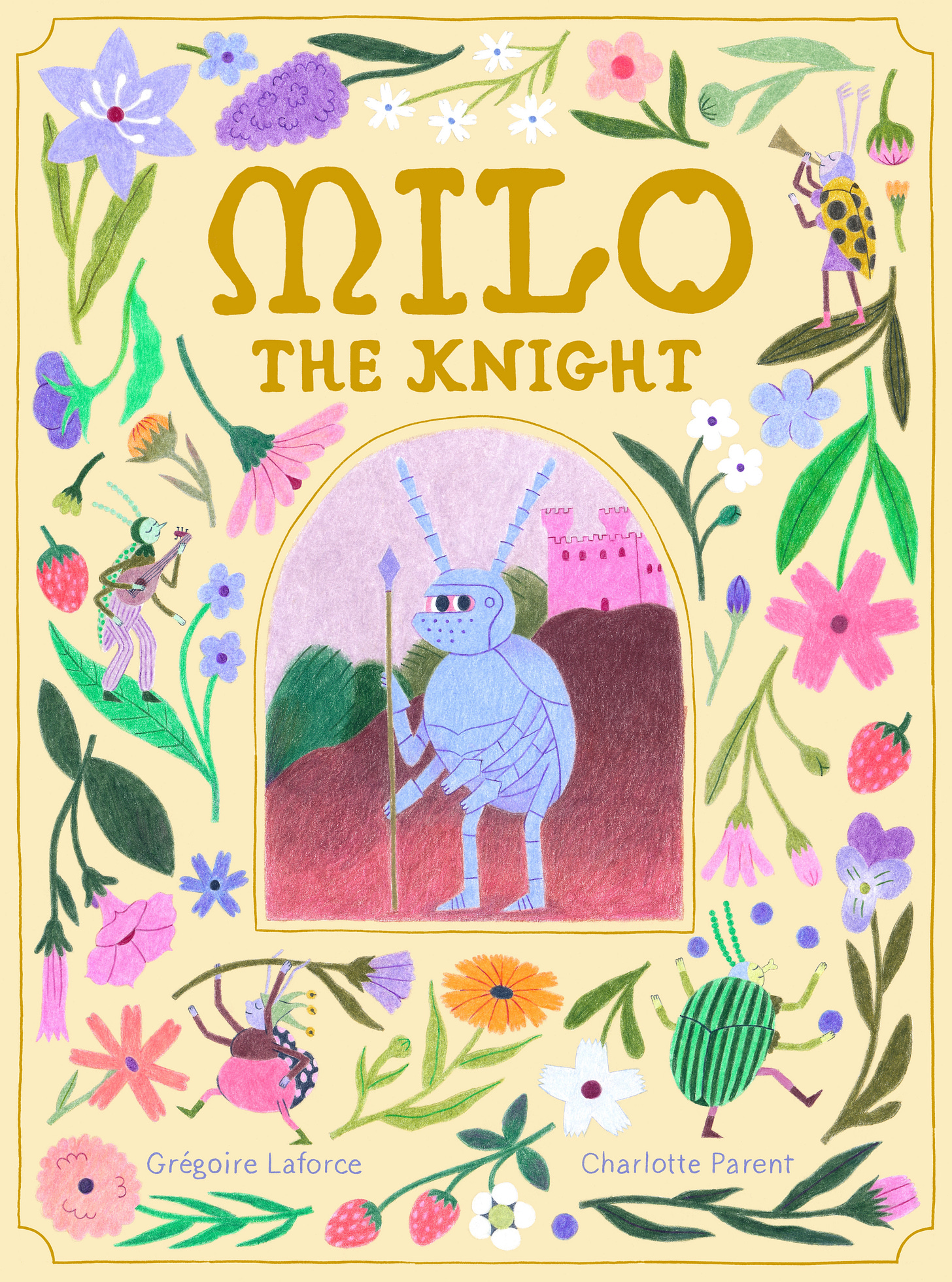
In the end, all of those changes really did make the cover better!
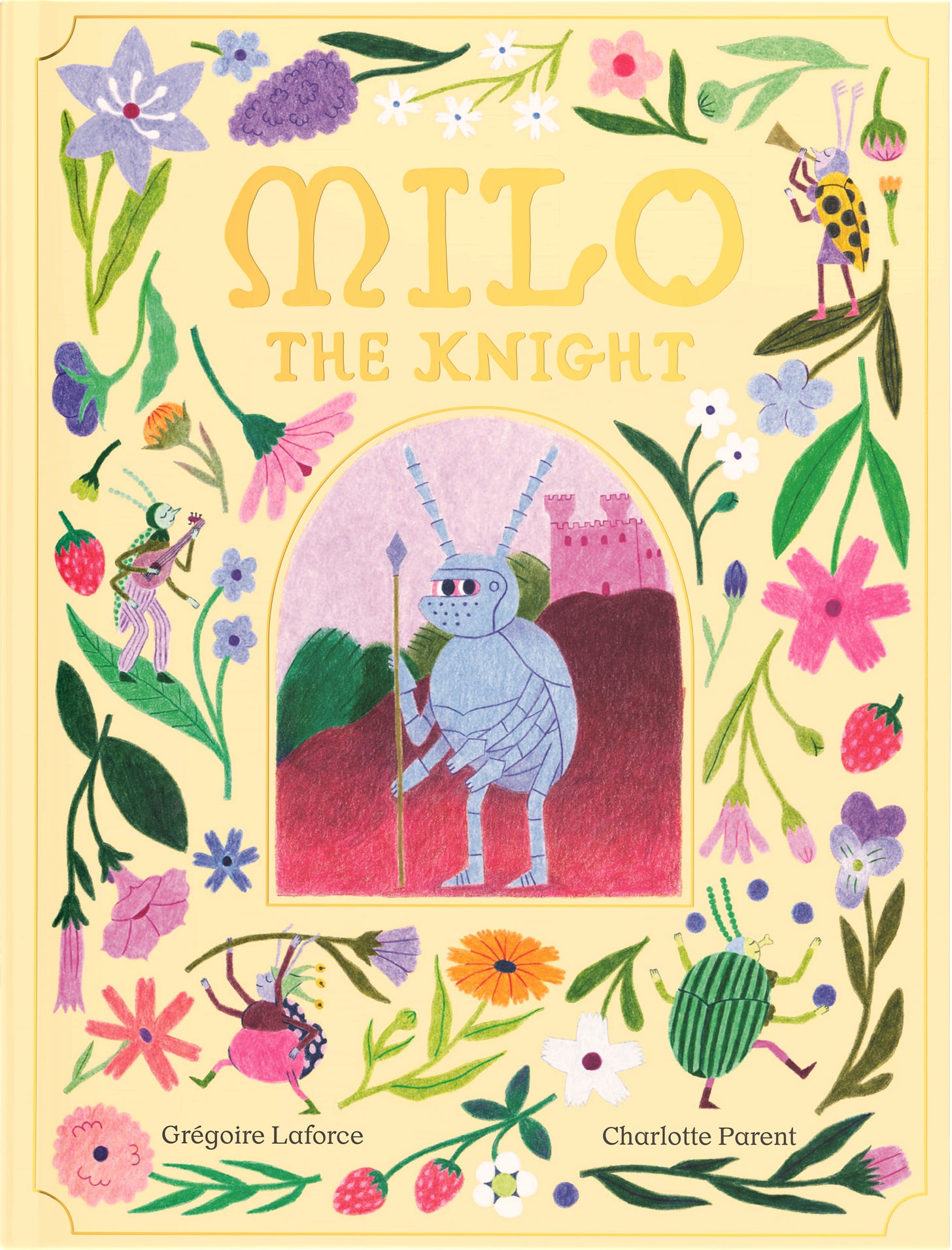
I’m glad we stuck with my handwritten type for the title through all of this. I like it a lot!
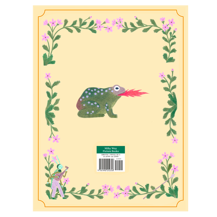
For the back cover, as you know from the thumbnails I shared above, I wanted a single fire-breathing dragon. Here is the illustration:
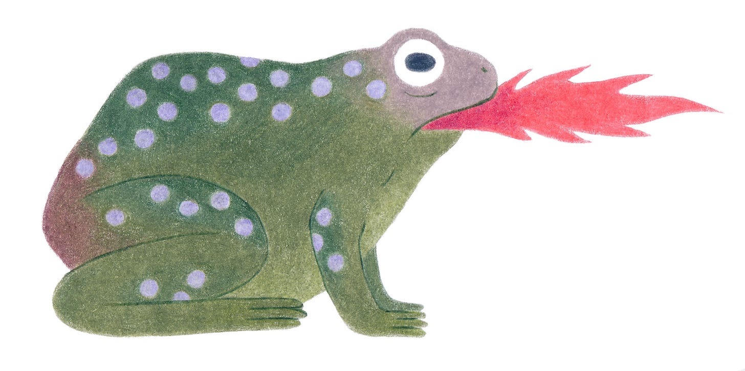
When the book designer put the jacket together, he saw that something was missing and added a decorative border (from the pages) around the dragon.
I liked the idea, but that border just happens to be one of the illustrations in the book I don’t like so much. In every book, there are a couple of those. It’s normal and I can live with it. But I didn’t want one of them on the back cover! I tweaked another of the borders and suggested that we use that instead.
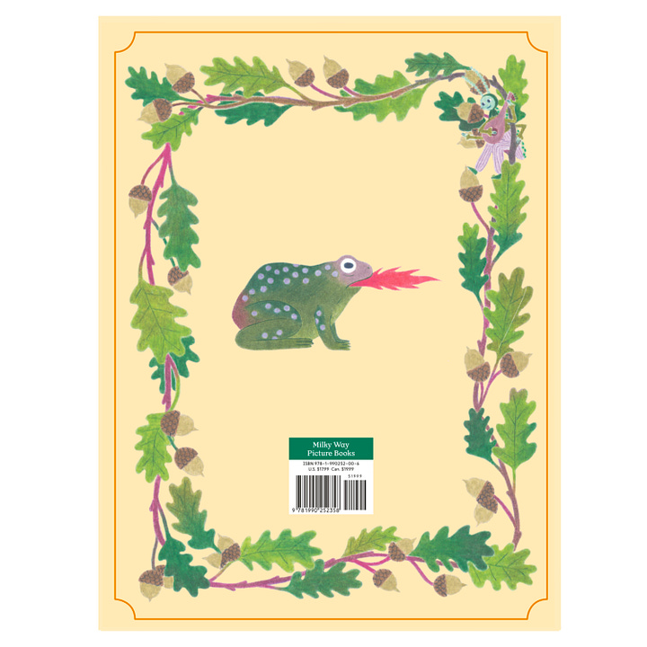
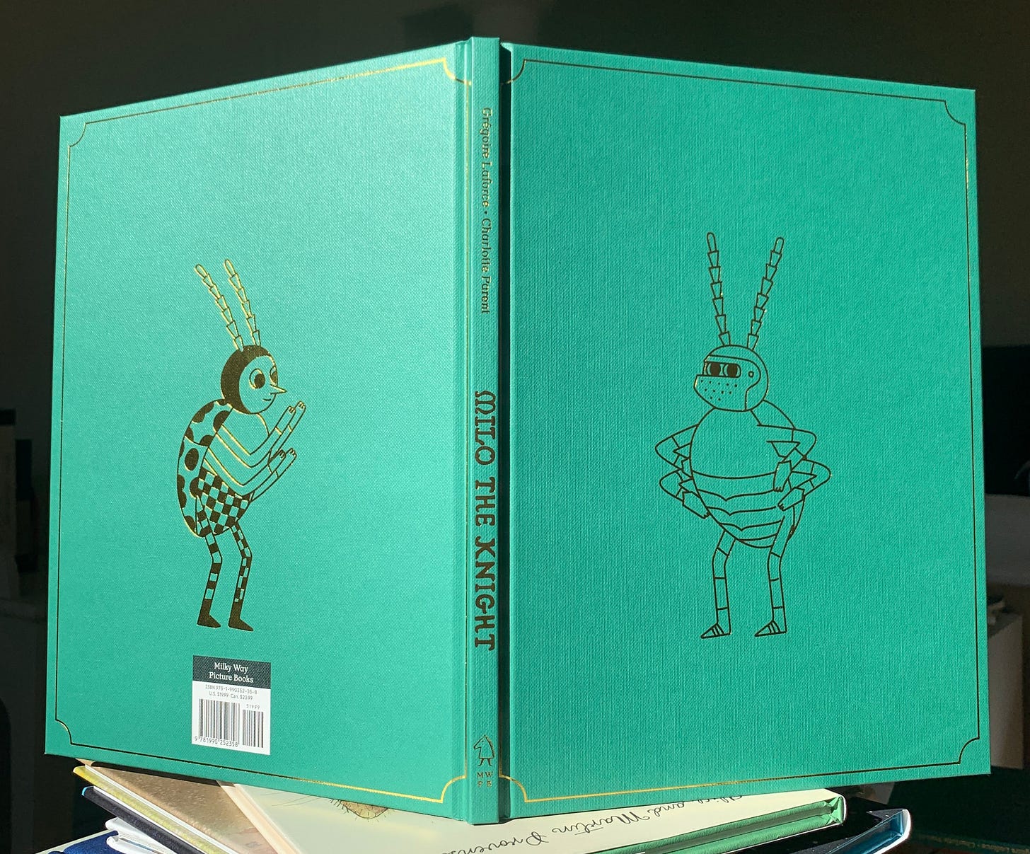
For the casewrap – the cover under the jacket – I wanted a design that would evoke old books. I suggested that we give the book a cloth casewrap with gold foil elements.
I love it when book design elements have a narrative function. I decided to put Milo in his armor on the front cover, and Milo without his armor on the back cover, as a hint of the transformation that the character would undergo within the pages.
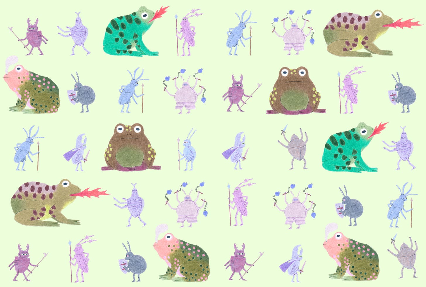
Picture book endpapers are one of my favorite things. They can do so many different things – set the mood, establish where a story takes place, introduce characters… They are the way in and out of the book.
In this case, I wanted them to work kind of as a prologue and an epilogue. The front endpapers introduce Milo’s world at the beginning of the story: a world in which there are dangerous dragons that can only be contained by tireless knights.
Can you spot Milo?
The back endpapers are different. They show jesters celebrating with dragons (if we can still call them that?) that don’t look dangerous at all.
Can you spot Milo? Doesn’t he look happier?
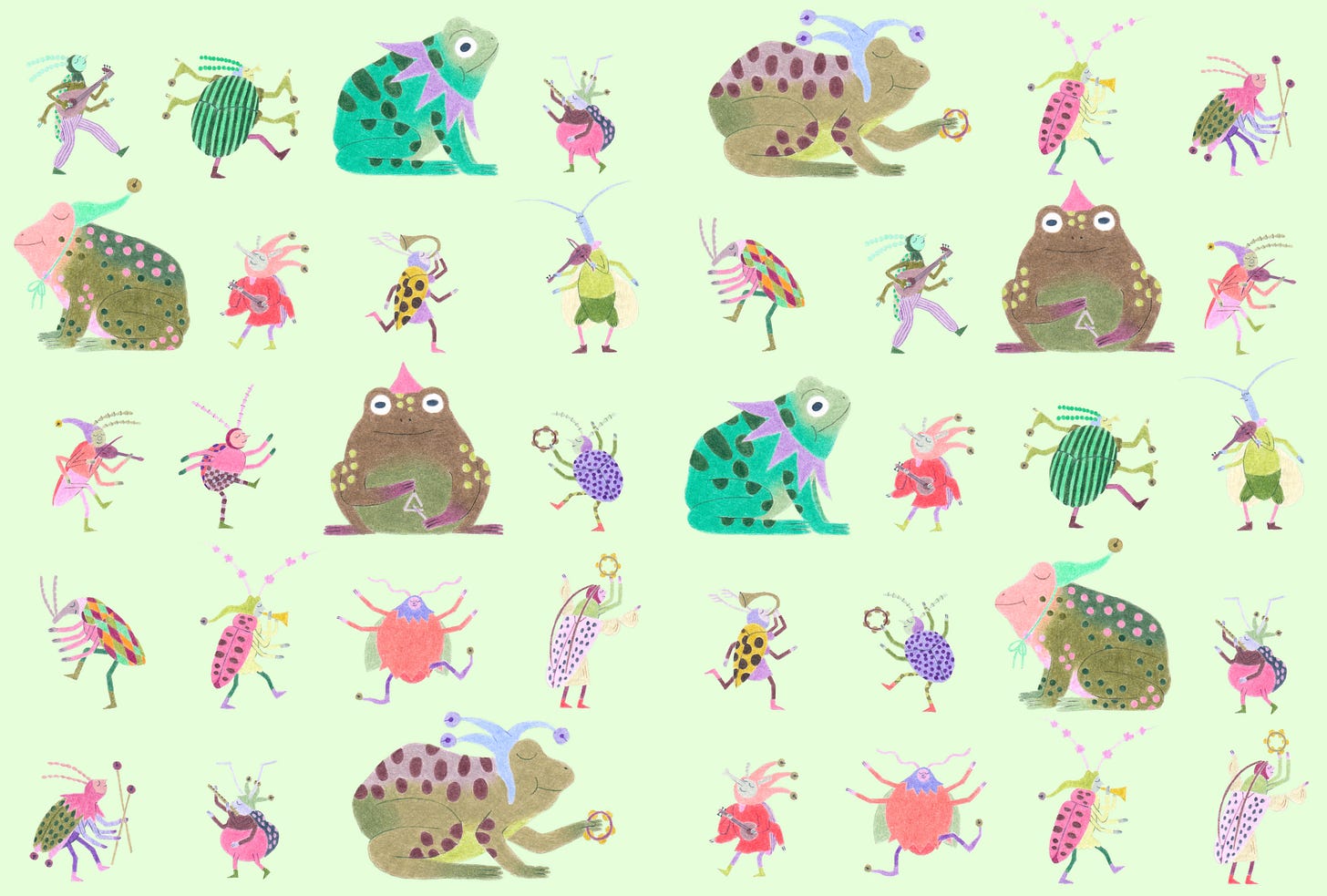
These last endpapers provide a few extra clues to the reader as to how the story might end. The last line of the text is very open – “Milo skipped into the sunset, ready to meet his first dragon.” I had originally suggested adding a wordless spread with Milo riding a dragon at the end, but we ended up leaving that out to keep the end more open.
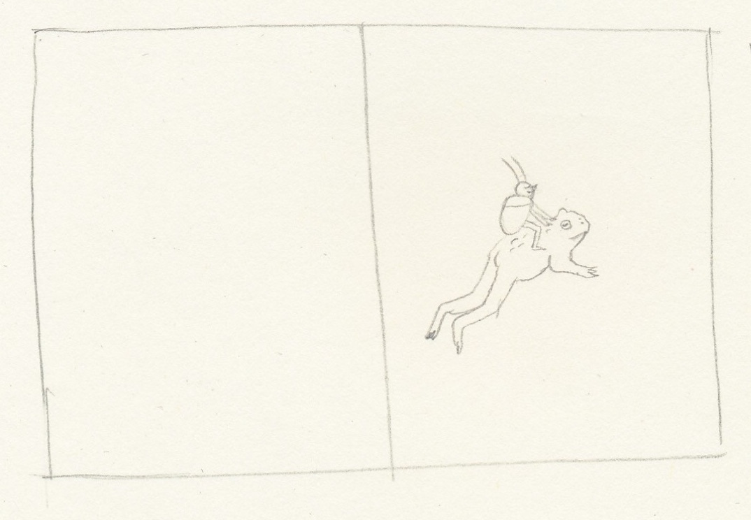
The festive endpapers suggest an end to the story in which Milo relates to the world (and to “dragons”) in an entirely different way… without being too prescriptive.
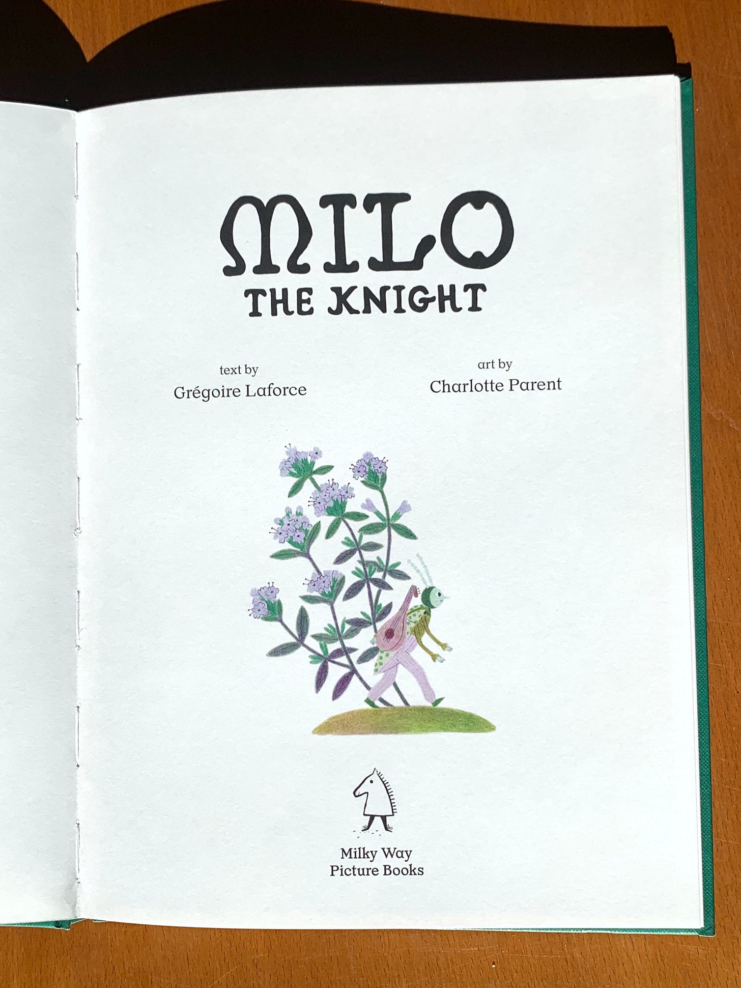
One last little paratextual element that I had fun with: the title page illustration! Here, again, the illustration is a bit of a prologue (or just an inhalation before jumping into the story). It’s the narrator arriving with his lute on his back, ready to start narrating on the next page.
I also added this illustration on the last page, after the narration ends:
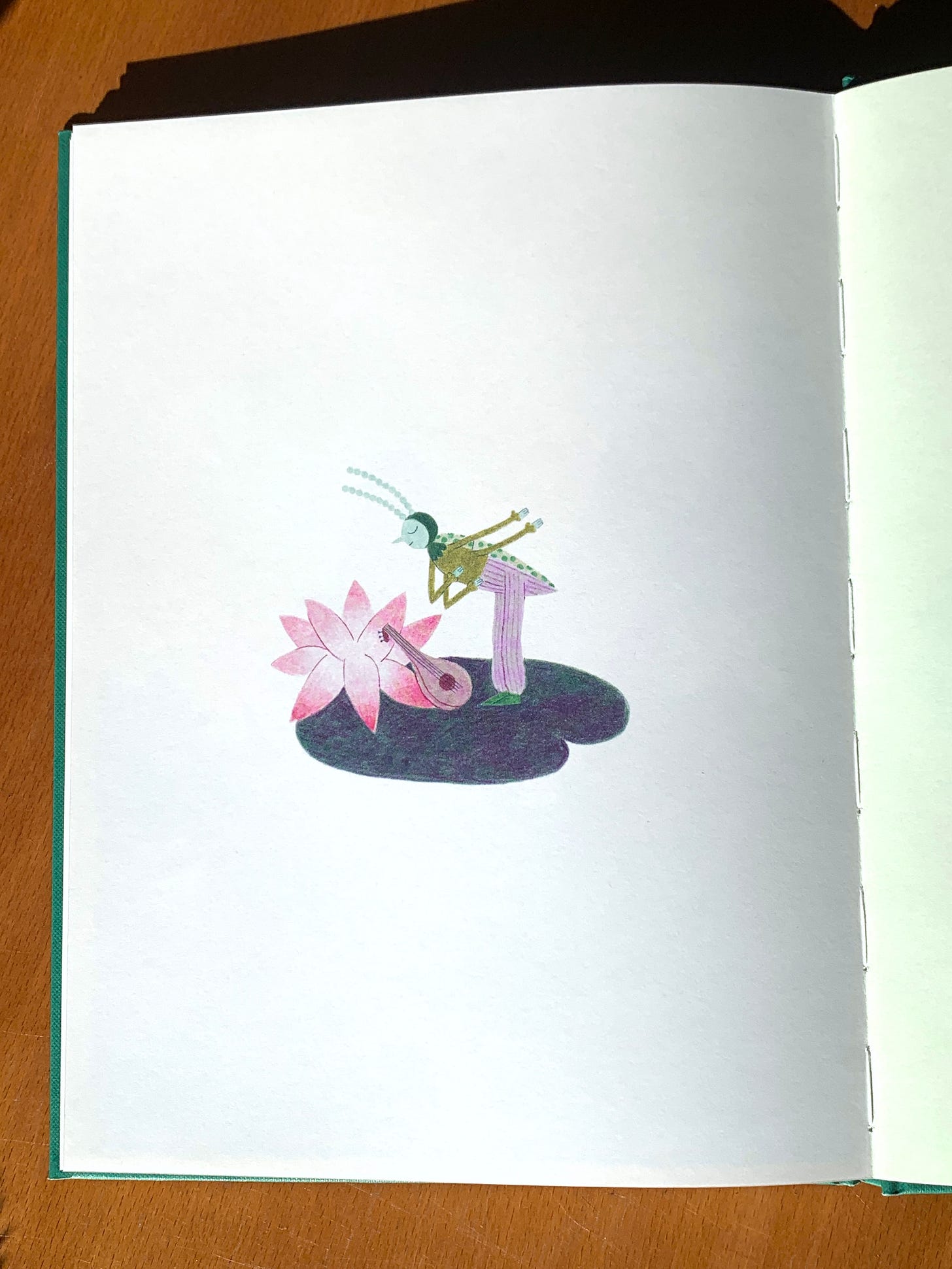
Together, these two illustrations frame the story as a performance – which it is, since picture books are meant to be read out loud!
That’s it! We made it! This was the final post in the “Milo: The Process” series. Let me know how you liked the series. Do you have any questions that remain unanswered? Leave a comment if you do!
If you can, and if you haven’t already, please fill out my two-question, multiple-choice survey to let me know what you’d like me to cover in my next posts. Or let me know in the comments!
And make sure to subscribe so you don’t miss whatever is next!
Thank you so much for being here. Until next time!
link


