What Color is Taupe? Plus 5 Ways To Use It In Your Home
For the past few years, curating a quietly luxurious aesthetic has become the goal with interior decorating. We’ve seen brands and designers all start to lean towards a more pared-back and minimalist look — but neutral doesn’t have to mean boring. In fact, introducing these more subdued shades can help counterbalance loud prints and patterns, and one designer favorite is taupe.
But what color is taupe, actually? Esteemed New York-based interior designer Paris Forino describes the shade as “a great neutral, as it’s more distinctive than white and aptly pairs with exciting colors.”
Below, we break down the color taupe, along with sharing some of the best ways to introduce the shade into your neutral color schemes at home.
Taupe: Explained
Trina Rogers, an owner and color consultant at Five Star Painting in Temple, says, “Taupe is a neutral that sits between gray and beige and typically has violet or pink undertones.”
How Can I Style Taupe?
Taupe can be used as an accent color, or as a base color if you’re looking for a neutral paint that will help make your space feel warmer. But no matter where you use it, taupe is a color that creates undeniably chic and effortlessly elegant rooms.
These are some of Paris Forino’s favorite ways to use the color taupe in your home.
1. Use taupe as a living room backdrop
This Greenwich Village townhouse features a neutral living room drenched in taupe. “This provides the perfect backdrop for bold, black and white curtains and an energetic magenta ottoman,” says Paris. “The softness of the neutral helps the sculptural, organic wall sconce stand out as a statement in the room.”
If you use taupe as your canvas, then let colorful statement pieces be your brushstrokes — you can paint any picture you want.
2. Emphasize natural bathroom materials
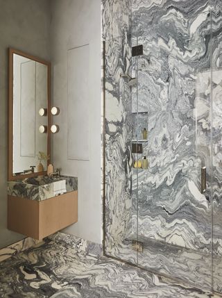
(Image credit: Genevieve Garuppo. Design: Paris Forino)
Taupe is a color that layers particularly well in most schemes, as it can often be found in nature and natural materials, as seen in the stunning stone veining in this chic marble bathroom.
Speaking to this Tribeca residence, Paris says the touch of taupe “makes for a visually interesting natural pattern, which is striking and compelling against the other neutral colors and natural textures in the space.”
While subtle, the taupe veining helps to balance the floating timber vanity and brass hardware, while the lights by the mirror add to the soft ’70s vibe created by the swirling stone.
3. Create a more welcoming entryway
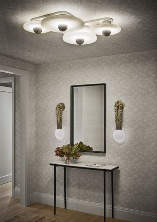
(Image credit: Douglass Friedman. Design: Paris Forino)
The warmth and natural ease of the color taupe makes it perfect for welcoming color schemes, says Paris. Especially when used in a subtle wallpaper design, like this monochrome geometric print. The overall effect is visually engaging, but not overpowering.
“It doesn’t feel too busy, and it also provides the perfect backdrop for metallic finishes, like the jewel-like sconces and modern semi-flush lights in this entryway,” she adds, noting how taupe can complement even the most extravagant entryway lighting ideas, where white could appear too stark or contrasting.
4. Pick a more “thoughtful” kitchen color
(Image credit: Douglass Friedman. Design: Paris Forino)
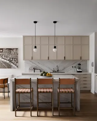
Paris says bright white, monochrome kitchens look too ‘off the shelf’ these days. “A more thoughtful shade like a taupe is impactful if you still want a neutral kitchen cabinet color, as it looks more designed,” she adds.
In this kitchen, “the warmth of taupe provides a great backdrop for the bold black pendant lights and cognac leather counter stools,” says Paris. Through clean lines and accent pieces, this space makes neutrals look bold. Black, white, and gray all show up in this space, helping make the caramel chairs really pop.
5. Soften bold patterns in the bedroom
(Image credit: Nils Timm. Design: Paris Forino)
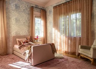
“Taupe layers well with patterns because it is such a versatile neutral,” says Paris. It can also help to soften their impact in spaces where you may want to curate a sense of calm — like the bedroom.
“Taupe relates more closely with patterns than white can,” adds Paris. “In this bedroom in my Beverly Hills home project, the taupe upholstery helps emphasize details in the detailed cloud pattern of the wallcovering.”
In this context, taupe acts as a beautiful backdrop, turning this neutral bedroom idea into a soft dreamy sanctuary.
FAQs
What colors go with taupe?
According to Trina, taupe complements a wide range of colors, including “blues, greens, pastels, dusty pinks, earth tones, and many other neutrals.”
But a word to the wise: test it in your home before you buy. “If you have a taupe that leans more into a pink undertone, those tones could show up more if paired with a green,” warns Trina.
Like your favorite pair of jeans, once you know what color taupe is, you’ll discover that it goes with just about everything. It’s a chameleon color that almost always looks good. If you’re struggling to style a bright piece of furniture — particularly one with violet or pink tones, like the “cabernetcore” trend — taupe is the perfect not-quite white that provides a softer contrast.
link


